

VannSpar
Educational project • UX research, concept and lo-fi design • 2022
We are living in a reality where our most valuable resource is so deeply undervalued to the point of it’s supposed extinction in 2040. The resource in question, water, is rapidly being tapped out, and we are soon getting to the point of no return.
What can we do to stop it?

I was the sole UX researcher and UX designer on this project, during the time period of cerca two months (only afternoons).
First step: Understanding the audience.
My plan, goals and execution
Since we already know the overall problem (that water as a resource is being used in a much too high concentration for us to be able to keep up) I decided to take an exploratory approach for this project.
The things I want to know the most
Who is using the most water?
What do consumers know about water wastage?
How can we motivate people to save water?
Some other things that would be nice to know
Why do people use water?
What do consumers do that contributes to excessive water loss?
How are people using water?
My projects research toolkit 🛠️
-
Water scarcity is an already heavily researched topic, so I conducted a literature review in order to reap the benefits of this research, while also being able to draw connections and contextualise it with my new insights.
-
I sent out a survey asking about Norwegian peoples water usage habits - and got around 18 replies.
Note that 18 replies is not enough to be sure that the patterns we see are representative for the whole population of Norway. Ideally I would have gotten at least 50.
-
I conducted 5 semi-structured interviews on people aged between 18-60.
-
I wanted to get some insights as to what is already on the market today, and what features they had. In addition I conducted a SWOT analysis in order to get some inspiration on what to do or not to do in my own solution.
-
As the project progresses and I had gotten a low fidelity prototype ready, I conducted 5 usability tests on people within the target audience.
I will talk more about this in the usability testing chapter.
I learned that…
Top contributor: agricultural businesses, mainly meat
The fashion industry
People who eat meat
People who have less knowledge about the effects of water scarcity/water footprint
Who is using the most water?
How can we motivate people to save water?
We can motivate the audience to use less water if there is an economical gain for the user.
We can motivate the audience to save more water if we make information about water, water scarcity and water footprint more easily available.
What do consumers know about water wastage?
Consumers seem to have very little knowledge about the issues regarding water wastage. Over 50% of survey participants and almost all interview participants reported having no knowledge of their own water footprint, as well as having no knowledge of how to minimize it if they ever were to start.
Many interview participants excused themselves when talking about how they use/waste water. There seems to be a general “understanding” that one should not waste water, but no one seems to know why or how, and thus feels guilt when talking about it.
Why are people not saving water?
There is a lack of information about water scarcity and water saving written in a way that’s digestible to the general public
Who do i want to focus on in this project?
People with low income - hereby young people and students
A user scenario:
Problem statement
People in Norway are finding it difficult to save water because they lack information and knowledge about why and how they should do so. They also lack motivation.
If we can solve this problem, it would positively impact Norway because our water supplies would last longer.
OK, so we have a general understanding of the audience. Now what?
We need to find a way to make information easy and accessible to the public. The data reveals that people are struggling with a lack of information about the subject, and thus not know if and where to even start with saving measures.
Money seems to be a great incentiviser. Implementing any kind of money vs. water usage feature in to the product might be a good way to motivate people to use less water.
What consumer-friendly digital solutions for this already exist?
Spoiler: not a whole lot.
But there are some - and here’s an overview of 4 apps I could find, and their functionality.
The apps functionality overview:
Key takeaways from the competitor research 👀
There is a lack of bite-sized facts about how to save water (The information exists, but it’s often a long read). It also seems to also be lacking a why these tips help.
If the app has water tracking, it is likely manual tracking - meaning that you have to tap on a button on your phone every time you use your water source.
Note from Julie: That’s not very convenient, e.g. as you often want to wash your hands because they are dirty - and tracking your water would require you to touch your phone regardless.
These apps are often basing themselves upon assumptions of how much water comes out of your faucet.
There is a lack of aesthetically good looking apps surrounding this subject.
There is a lack of household-water tracking (most apps only track your own personal water footprint)
Through an ideation workshop we came up with;
VannSpar - a solution that lets you track your water usage automatically using Gyro technology

During a workshop I facilitated with myself and one other user in the target audience, we did exercises like brainstorming, red dotting, brainwalking and the effort matrix. This laid the foundation of what the concept of this solution was going to be, and what the app was going to do.
I decided to only work on the mobile app for this project.
So how does VannSpar work?
The VannSpar sensor
Buy enabling the users to buy small (but very cheap) sensors that use gyro technology to track movement, users can fasten the sensor onto their faucet and other water outlets, in order for the sensor to track the estimated water usage.
Install once, and never have to wory about tracking water manually again.
The VannSpar mobile app
The VannSpar app enables users to track their VannSpar-sensor output, which gives them their esitmated water usage automatically with no need mor manual tracking.
It also gives an estimated water usage cost, based on the water electricity costs. Never be uncertain how much you pay for your water again.
(In Norway you don’t pay a lot for water, but the idea is that it can generate how much electricity was used to warm up the water, this giving you somewhat of an money estimate)
Creating simple flows that help the user towards their goals
(tap to view full size)Low-fidelity wireframing & prototyping
Here are some of the wireframes i made using Figma ♥️
The primary screens
The flow for adding a new sensor
Testing and validating the prototype
I conducted 5 different usability tests on participants in the primary target audience. The users were screened based on whether they were students or not, but other than that it was a guerilla testing approach.
The usability testing tasks
Create an account in the app
Find news about Water Scarcity
Install a new sensor
How much water was used April 2nd at 14:00?
How much battery power does Bad Kran 1 (name of a water sensor) have?
If the assignments were done quickly and we were left with a bit of extra time, I also asked these questions:
Can you walk me through the app and tell me what the different pages are about?
If you wanted to share this statistical information with the rest of your household - where would you go?
The metrics:
Task completion rates/times

Direct or indirect success
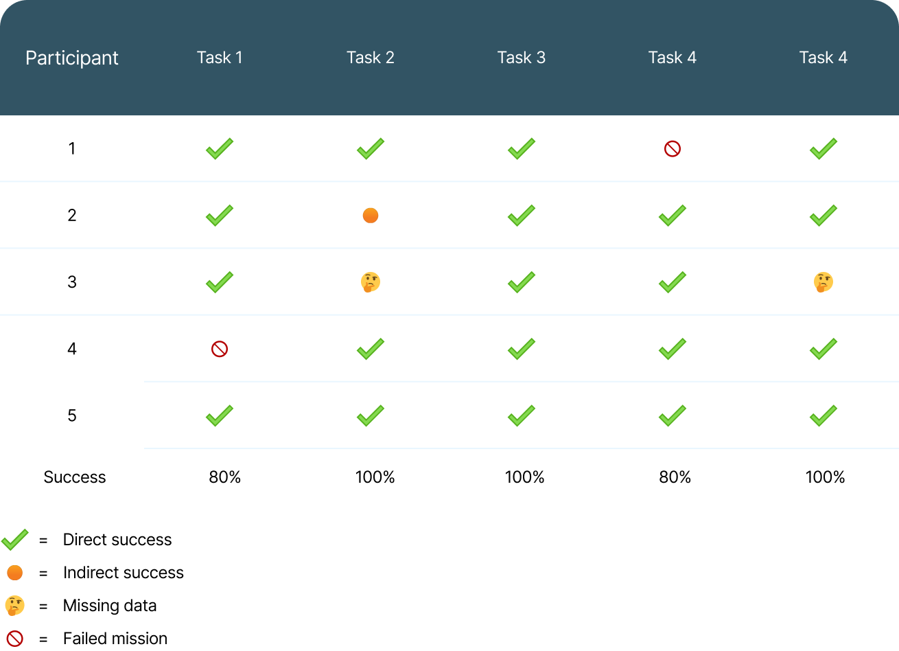
Key takeaways from testing
The task flows were largely successful, and people seemed to find the interface intuitive.
People did however NOT understand what the icons ment, so they had to click to the pages to understand what they were
People struggled to understand how to calibrate their device properly, within the “add new sensor” flow. Only two people performed according to happy path.
People understood what the pages were ment to do
Two participants did “struggle” over the same area (“sensoroversikt” page), even though they managed to complete the task in the end without help. The problem was that they did not see a way to switch the month from May to April (hence leaving them stuck in may when they were looking for something in April).
What did i change after testing, and why?
Conclusions and recommendations
Areas of improvement
During the preparatory research stage/empathise stage, I wish I had conducted one or more contextual inquiries in order to get more insight as to how a person uses water in a more natural and relaxing environment. It was clear that several people found this subject a bit hard to talk about, as they seemed to feel pressured to say things that where morally right, or excuse their behaviours, because they felt pressures by societal standards.
I could have broadened the usability testing audience from just students - and made the concept and project more validated and reliable - but alas this niching down helped me find participants fast, which is what I needed at the time.
I could have involved the end-users more in the process while designing the low fidelity wireframes. Co-designing, if you will. I think involving them would have benefited the project by removing biases (from me) during the process.
Section of appreciation
A big thanks to all whom were a part of the process - either if it was through interviews, ideation workshops, card sorting or usability testing. Your feedback made this project possible - and it would have been terrible without it.
Further recmmendations from me - to me - moving forward
Have more and better labels and descriptions. E.g. labels on navigation items, so the user can be sure what to expect. This is also an accessibility issue. We don’t want the users to guess what content a tab has. We also don’t want to rely on.
Remove elements that do not explicitly serve a purpose - and avoid having the same functionality in different places. This means really walking through everything and make sure it serves a purpose (that is also not possible to do any other place - or at least make sure that the functionality is only visible in the place where it makes most sense)
Conduct more testing to see if the changed bettered the solution
Hope you enjoyed - and thanks so much for reading!
Check out my other projects ✨
-
![]()
A mobile application that simplifies and enhances hamster care.
Hamster owners worldwide are struggling. The solution?
“The hammy project”
-
![]()
The social platform for Imagine Dragons fans
As part of a UI & prototyping challenge I was confronted with making something silly, yet beautiful. There may exist prettier apps than this, but I guarantee that you won’t find any sillier 😅
-
![]()
Helping Trøndelag get fit - one website at a time
Design and development of a responsive website for the fictional business Trøndelag Trening - making sure the experience is smooth all the way from sign-up to booking.


